Personal
Fleurieu
“How might we increase festival engagement for stakeholders?”
Case study for omni-channel product design
2020
Festival Fleurieu is a biennial festival that celebrates artistic endeavour across South Australia’s Fleurieu Penninsula. The existing website required an optimised digital experience for both mobile and desktop to improve accessibility and navigation.
Executive summary
-
The existing online presence is not mobile-friendly, and is overloaded with information that is difficult to navigate and consume. The festival operates with limited customer service personnel, and unfiltered phone enquiries are consuming too many resources. This means that promotional marketing activities allocated to these staff are reduced.
-
To create a digital presence for Festival Fleurieu that:
— Allows users to interact with the festival.
— Provides a resource hub of information to improve festival metrics.
— Increases event accessibility and attendance.
— Streamlines marketing communications to build brand awareness.
-
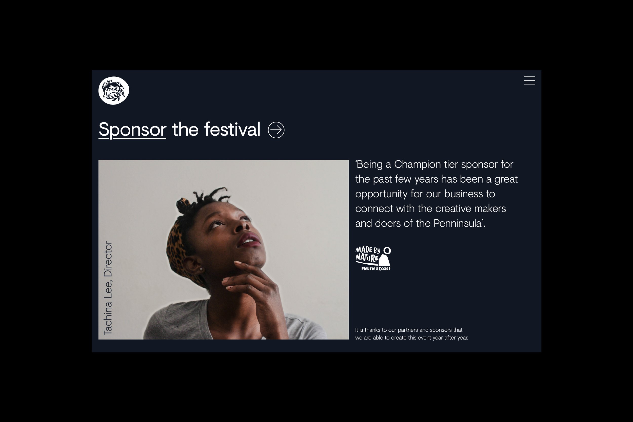
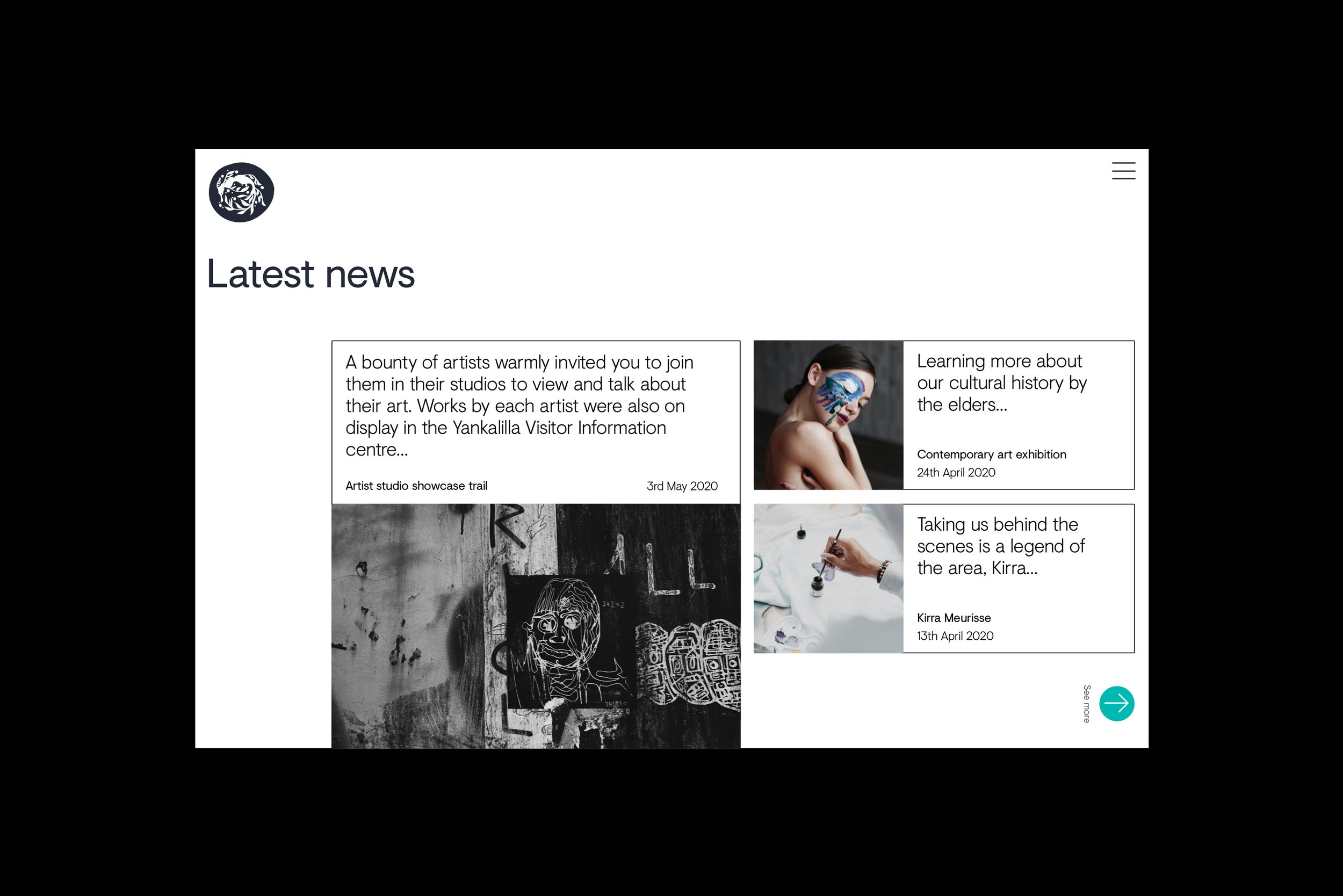
Responsive mobile app, and resource-based simplified website for detailed festival information. Higher engagement levels required for the app, as website requirements provide a more direct contact opportunity reserved more for sponsorship enquiries.
-
Optimal Workshop — User research
MIRO — Collaboration and user flows
Sketch — Design and wireframes
Figma — User testing and prototyping
AfterEffects — Animation and interactions.
App solution
App solution
Event search and explore
The home section contains events saved by the user, and presents relevant news to stay updated. The explore section displays events by category, a filtered search, and a series of recommended, popular and nearby events. This aims to increase visibility and discoverability of relevant events to the user.
Onboarding
Creating an account profile allows users to customise their festival experience. Users can sign in through social media account integration, or through email. Accessing as a guest prevents their information from being saved.
Prompting the user to select the events they are interested in kickstarts the event exploration, and tailors the home page to recommend relevant events.
Personalised schedule
Many events require reservations, and often span across multiple dates and times. This meant that capacity needed to be tracked to prevent overbooking. Users can save events of interest to their bookmarks, where they can view all saved events and be notified of relevant updates.
Users can view a calendar schedule after reserving an event, where they can edit, delete or share a booking. The user is also alerted to any overlapping times when reserving an event. This allows them to reschedule or delete an event, and avoids event scheduling conflict. For events that do not require reservations, the CTA changes to ‘Add to schedule’, which will not become affected by scheduling conflicts.
Ticket purchasing
As the festival spans multiple days, a customised ticket offering was created. Users can choose the days they will attend, and the price will change accordingly. The ticket allows them to enter the festival, and is used to record event reservations.
If the user is attempting to reserve an event without a ticket registered to their profile, they are prompted with a modal informing them a ticket must be linked to their account to proceed. Post purchase, the reservation will be confirmed. This keeps the shopping and browsing experience seamless.
Help centre
Under profile, users can navigate to support pages, where they can look for helpful information. To ease the burden of phone enquiries, users are encouraged to message the festival through the app.
A messaging module records conversations users have with agents representing the festival. They can return to the app later without fear of the chat timing out, so they can answer at their own pace. For enquiries that relate to sponsorship and partnering opportunities, the agent will fast-track the user to the phone line for the festival.
Interactive prototype
Interactive prototype
Website solution
Website solution


Reflection
Due to development constraints, there were multiple features from the app that had to be omitted. If more time allowed, the following would have been iterated:
i. Ratings and reviews: interviews showed that users often evaluate if an event was worth reserving by considering the opinions of others.
ii. Showing capacity in real time: would allow the organisers to better track ticketing, and users can gauge popularity and booking capacity.
iii. Sharing custom schedules with friends: interviews also revealed that users often buy tickets for their friends, and want to ensure they attend the same sessions together. A feature that facilitates this could enhance the experience of users.
This project was a large scale application that required both app and website products to be created. This meant that different features on each had to be prioritised over the other. Because the app had scaled higher on feature prioritisation, it had more thorough user testing and user flows. Moving forward, it is recommended to test the different elements on the website to see what features are working, and which need improvements.
product design; ux/ui; motion design, experience design; responsive design; website; app; animation


